
For many, social media has reached its nadir. The white noise of selfies, self-glamourising lifestyle presentation and comedy cat memes is fast becoming the online equivalent of being trapped in a provincial shopping mall. Hell really is other people – and they’re all on your smartphone.
However, if we look beneath the banal surface there are some fascinating subcultures to be explored online, particularly on visual platforms such as Instagram. People are turning toward the often subtle power of images to express something about their lives, their feelings and their environment in a quieter way.
For those with an eye for graphics, there is currently an upsurge of interest in street typography, graffiti and long-extinct signs. Those involved in this movement are an eclectic mix, including artists, graphic designers, graffiti artists and design historians.
The street has long been a source of inspiration for artists and writers. As early as the 1930s, street photographers such as Brassai began to record urban landscapes in the same way that Gainsborough had depicted rural scenes in paint. His work often featured empty streets, decorated by signage and advertising. This visual language was later to be filtered by pop artists, to whom the language and imagery of selling was at least as important as literature or the work of the master painters.
Graphic designers, in particular, have looked to the street for ideas. In his seminal 1950s magazine Typographica, the graphic designer and typographer Herbert Spencer created an in-depth analysis of the visuals of the street, mainly in terms of how lettering contributes to the urban environment.
Travelling Europe with his camera, he documented and analysed how words and letterforms shape the modern experience and how man, via graffiti and other forms of raw expression, can make his own impression on the world.
In terms of contemporary art, a definitive contribution to the trend came in the form of Jeremy Deller’s Folk Archive, a wide-ranging project that celebrated handmade signs and artworks across the UK. This joyful celebration of the homemade or naïve is a long overdue exploration of the cousin of outsider art.
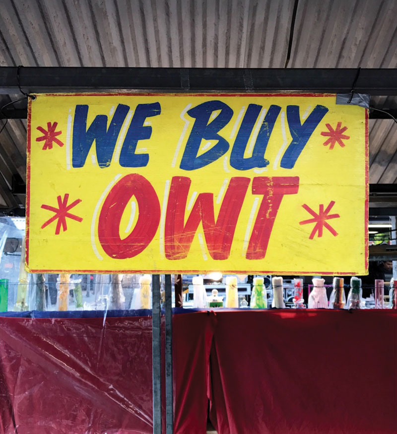
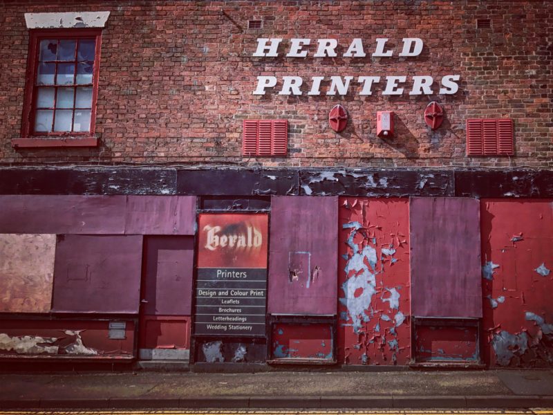
My own interest in displaying/documenting street graphics is via @blackcountrytype, a photography project that aims to record street graphics, amateur typography and graffiti in the region. This is just one of many sites that focus on the beauty of signs, lettering and font in the urban environment.
These sites appeal to a wide range of interests. For some, there is a definite sense of a lost culture, a nostalgia for a more stable time where established shops and businesses employed signwriters and type designers.
The lost art of signwriting was being lamented as early as 1974. In his photobook Facia: Facia Lettering in the British Isles, author Alan Bartram presented an optimistic view that; “if society cares about saving or creating a fine piece of lettering, it will probably care about the building it is on, and care about the street that it is in and care about the town that the street is in”.
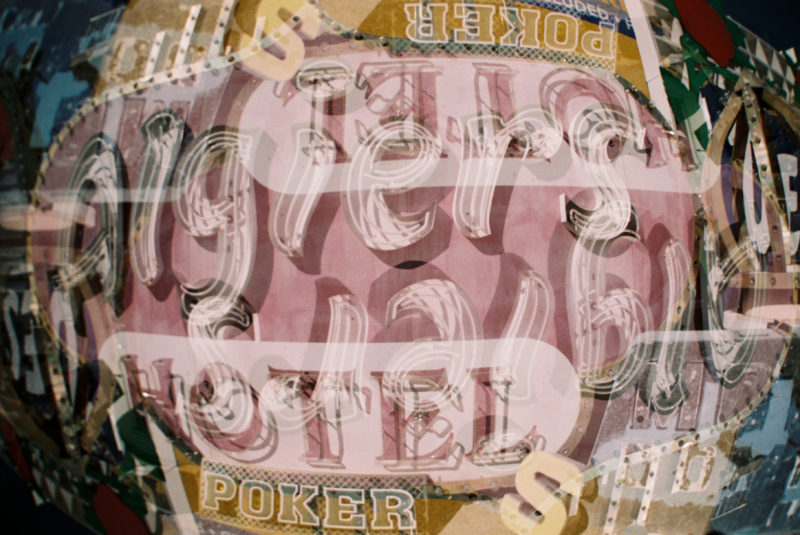
Katie Rey ‘Mighty Signs’
Other type enthusiasts are operating almost in a social documentary role, recording the demise of shops and industry in their region, a method of working that has similarities in the trend for documenting the decay of cities such as Detroit in the US or former soviet bloc countries in popular photobooks such as Soviet Ghosts: The Soviet Union Abandoned.
The beauty of the movement is that there are myriad ways to approach the subject. US photographer Katie Rey uses type as the basis for her experimental photography and is in the enviable position of being based in the US, the home of the neon street sign.
Closer to home, Janet Lees approaches street graphics rather like a fine artist, with her closely cropped images often resembling abstract art. There is a tangible calmness to her work, largely because she doesn’t burden the images with excessive description.
Janet Lees
An innovative UK project in found type can is Type Setting . Based around the city of Leeds, the site invites people to submit their own photographs of found typography. This has unearthed some hidden gems of typography and the overall ambition of the founders of the site is to develop an open source type that can be freely used by graphic designers and the public.
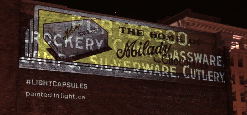
Photographers such as Type of London are exploring the vast potential of the capital city for images. This work is often akin to Psychogeography – the idea that physical locations can have a psychological effect on an individual. She is particularly interested in ‘ghost signs’, the faded remnants of hand-painted advertising, a form of typography that has a huge following.

3D artist Craig Winslow has created his own take on the ghost sign with a series of works that he terms ‘Light Capsules’. These are carefully constructed recreations of original painted advertisements that he brings to life at night using colour projectors. This is both an experiment in design and an attempt to take the viewer back to a bygone age.
Craig Winslow
The renewal of interest in typography and street graphics works hand-in-hand with a general move back toward analogue and handmade forms of production. Just as in music the vinyl record has seen a huge resurgence, today’s designers and artists are increasingly rejecting digital design, preferring to draw upon older letterforms to spark inspiration. This can be seen in current moves toward the “artisan”, handmade and retro aesthetics that are clearly discernible in the fields of fashion, design and visual merchandising.
Tom Hicks
blackcountrytype