Dave Twist on Glitter & Glue and Birmingham’s hidden punk story
There are Instagram accounts and then there are worlds. Dave Twist’s is firmly the latter, a rolling archive of sleeves, badges, flyers and fragments that feels less like scrolling and more like stepping into a teenage bedroom somewhere between 1972 and 1979. It’s easily one of Fused’s favourite accounts, not for nostalgia, but for the way it captures something raw, obsessive and visually electric about music culture before it was fully understood, packaged or historicised. Now, that world has been fixed – properly – in print.
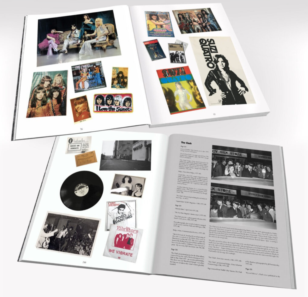
Glitter & Glue takes Twist’s collection of rock ’n’ roll ephemera and turns it into something far bigger: a vivid portrait of how Birmingham helped shape the journey from glam to punk and how style, print and obsession became part of a generation’s cultural education. Told through objects as much as memory, it’s a book about what it meant to find yourself through music, not in London or New York, but in the Midlands, where imagination filled in the gaps and made everything feel just a little more dangerous.
From teenage obsession to cultural archive
Glitter & Glue feels like much more than a nostalgia project. At what point did you realise your collection wasn’t just personal memorabilia, but a genuine cultural archive?
I was persuaded to finally embrace social media, creating a reel on Instagram and viewing it as an extension of my design portfolio – a kind of public ‘mood board’. A way of stating “this is where I come from, this is what I understand…”. I guess the layout – playing across the grid format of the platform – was pretty innovative, and people came on board quite quickly. There was a terrific response to the material I was posting. “This should be an exhibition!”, “This should be a book”. So, being by nature quite self depreciating, it gave me the confidence to press ahead, that this stuff and the aesthetic I brought to it, through its selection and its presentation, had a wider appeal.
Glam, punk and the pace of change
The book traces a path from early 70s glam and freak rock through to punk. Looking back, what connects those worlds for you more than what separates them?
I borrowed songwriter Mike Chapman’s line of those years being a ‘Teenage Rampage’, and it was wild and something of a blur. I don’t think anyone today, with what is left of the industry churning at a snail’s pace, could get much of a handle on the pace of it all. That you could discover an already out of print ‘oldie’ like ‘Raw Power’ only three years after its release – even as you were already excited by early reports of the Sex Pistols. The book attempts to capture that blur. Revisionists continue to push a roster of obscurities as being ‘proto-punk’. In truth, those of us who made up that first wave came out of fandom for Alice Cooper, Mott the Hoople, Faces and Roxy Music.
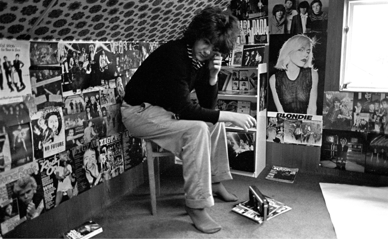
You describe yourself as being more visually attuned than sonically at first. What was it about sleeves, badges, flyers, posters and magazines that hit you so hard as a teenager?
I suppose it’s fetishistic, having and holding a piece of the true cross. If your life, in terms of aspiration and the possibility of contacting other worlds, was saved by Rock ‘n’ Roll. It was a splash of wild colour in a grey, school-uniformed world.
There is something very moving about the idea of a provincial teenage fan building this world piece by piece. Do you think being outside London made you a sharper observer and collector?
Being at that remove I supposed allowed one to build your own abstract notion of what these people did, how they lived. And that hazy fantasy was more potent than the reality I think.
Why ephemera mattered as much as music
Most music books focus on the stars, but Glitter & Glue gives equal weight to the printed debris around them, the ephemera, the design, the evidence of obsession. Was that always the point?
I had to make a choice in framing the imagery of the book. Do I re-write, in the age of AI, the thousandth bio of these people, attempt some journalese on critiquing their catalogues? Or, do I come at this from a more personal perspective? I figured that I’d rather read the first hand account of a kid who’d torn up a cinema after watching ‘Rock Around The Clock’, or had followed the Stones in the Jazz clubs of Soho, than ever haul myself though another artist biography. And that I’d travelled through a youth cultural epoch of equal significance
Your collection covers 1972 to 1979, which is such a charged stretch of time. Why did that era become your defining window, rather than what came after?
I think its pretty well acknowledged that those teenage years, the years of ‘firsts’ – are what one will inevitably value most and return to in terms of popular culture. After that one becomes, and indeed the culture itself seemed to become, rather too ‘knowing’.
Was there one object in the book that felt like the real key to everything, the item that somehow unlocks the whole story?
I suppose that Spec / 16 magazine – ‘Alice Cooper & Freak Rock! Holiday Special’. With a beaten-up and half-in-drag image of Alice Cooper on its cover. There’s the promise that Iggy, Lou and Roxy Music will all be inside too, and it chooses the far more potent ‘Freak-Rock’ over ‘Glam’ as its header. I had to fight to be allowed to buy such a lurid piece of poor role-modelling; my god-fearing parents seeing this thing as some kind of missive from the underworld. Which I suppose it was. So, at twelve years old, how much more thrilling could an object be?
Collecting at that age is rarely cool, calm or strategic. It is hunger, compulsion, identity-making. How much of Glitter & Glue is really about becoming yourself?
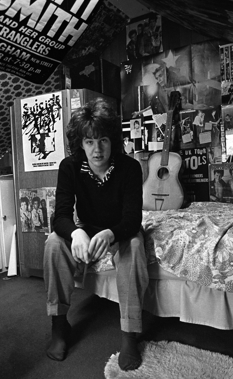
If you look at the photograph of me in early ’77 , pushing towards The Clash’s car outside of Birmingham’s Rag Market, hopelessly naive, ghastly haircut, shy even in the act of mobbing. Then flip to the photographs from only a few months later, where I could pass for a member of the latest hip New York combo. I’d rapidly managed to build a chosen identity from the stylist’s look-book of ephemera I’d accumulated, and from the influence of the new community that the chase had brought me into contact with.
You write beautifully about taste, instinct and attraction, the idea of just knowing something mattered before the rest of the culture caught up. Do you think collecting trained your eye as a designer?
I think I was very lucky to be buying my first long players at a point where their design was at some kind of peak. Pacific Eye and Ear’s packaging for, again, the Alice Cooper group was ingenious. High budget in an era when massive record sales could support that. A school desk that folded out and opened, the record wrapped in paper panties. An embossed wallet with a fold-out billion dollar bill inside. All of it die-cut and beautifully rendered. It was a world I could imagine getting into. Something I could fall back on, maybe – if being in a band / gang didn’t work out.
As a graphic designer, what do you see in 70s music ephemera that people might miss if they focus only on the bands? There is a strong sense in the book that print mattered in a very physical way then. Do you think younger audiences, raised in a digital world, can still understand that thrill?
The package carried the image of the mythical creatures who’s sound had been captured within. And the mythical creatures were indivisible from that sound; the ‘look’ and the racket were one.
The news was carried by the print surface too, thick board, paste-over print: this has travelled from the USA, I have it before anyone else, and for a while this thing is all mine. Bubble font, Donny Osmond on the verso: teen mag, blagged from a bopper at break time. Laminated front, matte flip-back liner: ancient historical artefact dating from maybe as many as ten years ago.
Was putting the book together an act of preservation, or was it also a way of resisting how fragile digital culture can be?
When Instagram abandoned its characteristic square format overnight I woke to find my carefully curated reel had been cropped and kaleidoscoped into an ugly mess. Although I did find a way to re-start through trial and error, the new format required the figuring out of a bleed area left and right of every image. But I was now painfully aware of the vulnerability of work on such a platform. So yes, the book was in part an act of preservation of all of that, the photography, the layout, the ‘look’.
Birmingham, imagination and the making of a scene
Birmingham runs through the story in such an important way. How do you see the city’s place in that broader pre-punk and punk narrative now? What did Birmingham understand about music and style that other cities sometimes missed? Birmingham in the 70s often gets framed as grey, hard or functional, yet Glitter & Glue shows it as a place of glamour, hunger and possibility. Do you think the city’s rough edges actually sharpened people’s imaginations?
It was only a short bus ride from the bungalows and cul-de-sacs of the Hollywood estate to somewhere darker and more dangerous. The labyrinth of tunnels, the night club doormen who didn’t care that you were clearly still of school age. When you’d pored over your copy of Guy Peellaert and Nik Cohn’s ‘Rock Dreams’, for hours, gazing at that one available image of The Velvet Underground huddled on a city street, then Brutalist Birmingham, in a greenish-grey Mercury vapour half-light seemed not too far removed from from a place where you might airbrush yourself into that scene.
How did your own experiences as a musician change the way you looked at the artefacts you had collected as a fan?
It was a frustration at first as the print options were so limited. So photocopy became the thing with the possibility of screen print, if the Institute of Art and Design technicians could be persuaded to moonlight. Re-sizing design elements or overlaying text was impossible with no access to repro cameras. So scissors, glue and Tipp-Ex were deployed instead. Now, these artefacts have their own appeal, but then? Honestly, we wanted colour and scale.
A lot of what you loved first existed at the fringes before becoming canon. Does it surprise you to see figures like Lou Reed, Iggy, the Dolls or Patti Smith now treated almost as establishment history?
I think that these acts were never quite as obscure as they have come to be romantically framed now. Iggy, the ‘world’s forgotten boy’, had the cover of Cream magazine three times, had Sounds, had the NME’s Nick Kent as pretty much his personal publicist. The Dolls had an absolutely massive press campaign around their first record. So did Patti Smith. All of these acts were, at the time of their debut, fielded with high expectations by major record labels. It was the public who didn’t, in any commercial numbers, for decades, ‘get it’.
One of the joys of the book is that it restores danger, weirdness and texture to artists who risk becoming over-familiar. Was that important to you?
Absolutely. One constructed one’s own fan-path through all of this chaos of print and formatting. I wanted the layout of the book to reflect that. A bombardment…
Today’s magazine retrospectives constantly seek to find order, to rate and give direction, to make sense of what was instinctive, organic and quite mad.
Did revisiting these objects bring back memories you had forgotten, or did some of them now carry completely different meanings than they did at the time?
The material relating to my own adventures has gained in importance to me over recent years. I think, given my relatively modest successes, for the longest time that stuff had gone unloved – was almost an embarrassment. Those feelings have evaporated now and it all seems, rightly or wrongly, as the byproduct of something almost heroic.
Design, memory and the physical thrill of music culture
Better Badges, colour Xeroxing, foreign sleeve variations, cassette adaptations, there is a whole parallel design history running through the book. Did you want readers to see this as a history of graphic language as much as music fandom?
It has become something of a cliché now to point out that the larger and more tactile nature of a record sleeve can carry so much more than a digital icon. How could you squint at an inch-square, 72 dpi product shot and figure out the details of how a New York Doll might accessorise their outfit? You couldn’t.
The years covered by Glitter & Glue were a chaos of competing formats, imperial paper sizes, print dimensions, very like the scene, nothing had yet been commodified into cost effective uniformity.
Is there a piece in the book that still gives you the same charge now as it did when you first got hold of it as a teenager?
In truth… most all of it. Turned out this wasn’t ‘just a phase’!
When you look back at the boy assembling this collection, what do you think he was really searching for, music, style, escape, identity, community?
All of that. Music – for all my talk of design, image, card stock and fonts – it would mean nothing without the thrill of a band like the Heartbreakers at full tilt.
Identity and community; I was searching for that, and didn’t, until much later, see that we already had that at its finest – sitting on our bedroom floors trading pix clipped from fan magazines.
Glitter & Glue isn’t just a record of what Dave Twist collected, it’s a record of how a generation built itself, piece by piece, in bedrooms, record shops and cities like Birmingham, long before anyone thought to call it culture.
You can order Glitter & Glue at easyaction.co.uk
David O’Coy